Response time monitoring
Track how fast your endpoints respond from your customers' perspective, and spot degradation before it becomes an outage.
Every check Hyperping performs on a monitor records a response time, measured in milliseconds from request to response. Checks run from datacenters around the world, so the numbers reflect what users in each region actually experience rather than what your servers report from the inside. For a one-off check without creating a monitor, check any URL from 17 regions.
Response time data is useful when:
- You want to confirm that a deployment did not slow down your API
- You suspect users in one region are getting slower responses than others
- You want to catch gradual degradation before it turns into downtime
- You need latency numbers to back up a conversation about performance
What Hyperping measures
Each check produces one response time data point, tagged with the region that ran it. Checks run at the frequency you configure on the monitor, from every 10 seconds up to every 24 hours, so a frequent check builds a dense picture of your endpoint's latency throughout the day.
Hyperping aggregates these data points by region and continent on the monitor's report page. The raw check-by-check records remain available in the monitor logs.
Read the response time graphs
- Open a monitor
Open the Hyperping dashboard and click on a monitor.
- Review the graphs
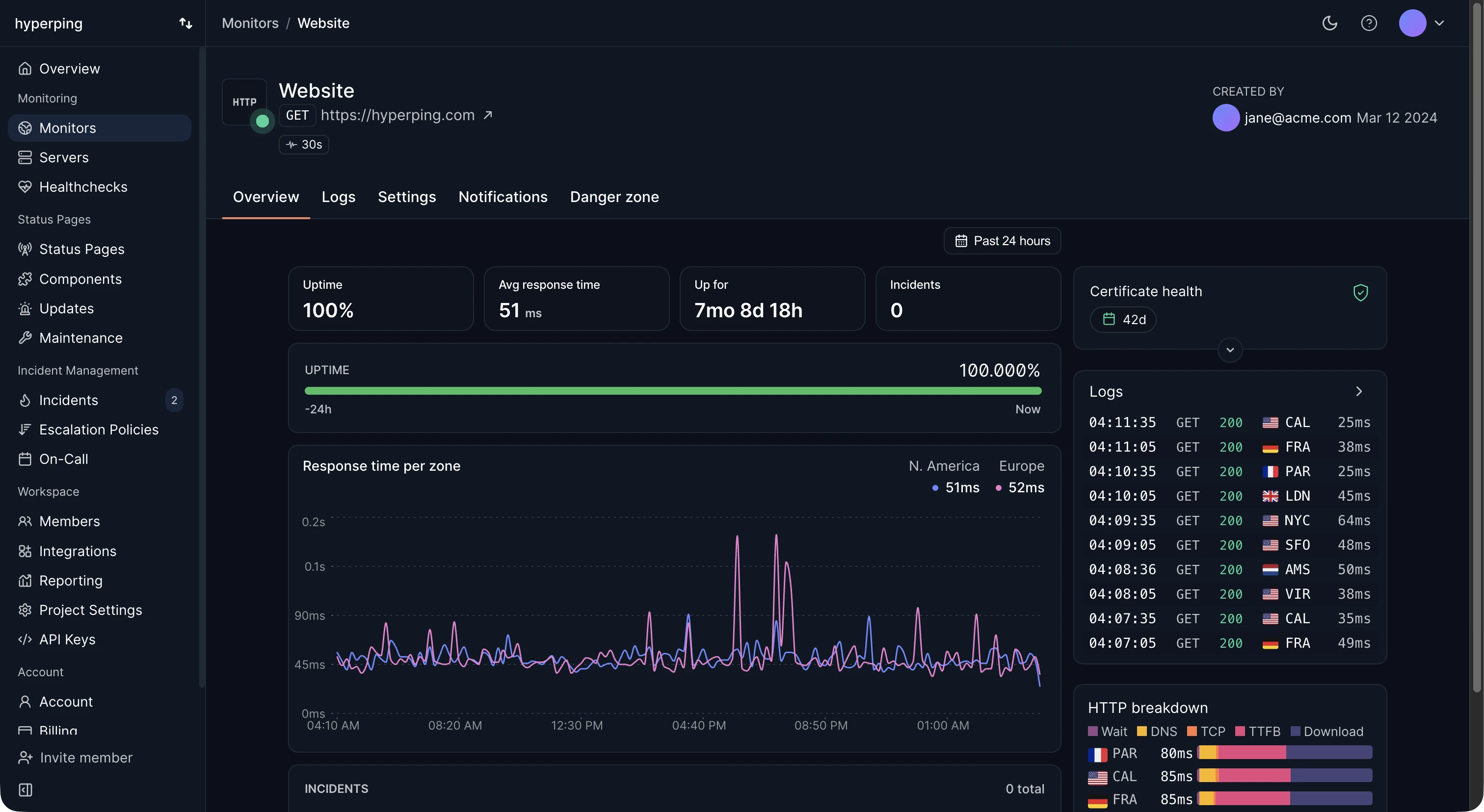
The monitor's report page shows response time graphs alongside its uptime data, aggregated by continent and region.
A few patterns worth recognizing:
| Pattern | What it usually means |
|---|---|
| Step change after a deploy | A code or infrastructure change introduced a regression |
| Slow rise over days or weeks | Growing load or data volume is pushing your service toward its limits |
| Isolated spikes | Transient events such as scheduled jobs, backups, or garbage collection pauses |
| One region consistently elevated | A routing or infrastructure problem specific to that geography |
Spot regional slowness
Hyperping checks from 18 locations across North America, Europe, Asia, Oceania, and South America. Because every data point carries its region, you can compare geographies directly and find degradation that only affects part of your audience.
If the regions being checked do not match where your users are, adjust them from the monitor's settings. See Datacenter regions for the full list of available locations.
Drill into individual checks
Graphs show the trend; logs show the evidence. When a graph reveals a spike or a slow region, open the Logs tab on the monitor's report page to see the individual checks behind it, each with its status code, response time, region, and timestamp.
This is the fastest way to answer questions like "was that spike one slow check or twenty?" or "did the slow responses also return errors?". See Monitor logs for the full field reference.
Uptime monitoring vs performance monitoring
Response time data from Hyperping tells you how your service behaves from the outside: whether it responds, how fast, and from where. It reflects the full path a real request travels, including DNS, TLS, CDN, and network transit.
It does not tell you why your service is slow. Internal metrics such as database query times, per-route latency, error rates, and resource consumption belong to application performance monitoring (APM). The two are complementary: Hyperping tells you that something is slow or down before your customers notice, and your APM helps you find the cause.
Track trends and export data
The report page graphs cover trend analysis for day-to-day work. For programmatic reporting, the Reports API returns SLA, MTTR, and outage data for every monitor in your project:
curl https://api.hyperping.io/v2/reporting/monitor-reports \
  -H "Authorization: Bearer ${API_TOKEN}"
Pull the numbers into your own dashboards or share them with stakeholders alongside the response time graphs.
Query response times from AI assistants
Hyperping's MCP server lets AI assistants query your monitoring data directly. The get_monitor_response_time tool returns the latency trend for your monitors, so you can ask questions like "did checkout get slower this week?" in plain language and get an answer backed by real check data.
The related get_monitor_anomalies tool flags latency spikes automatically. See the MCP server documentation for setup and the full tool reference.